
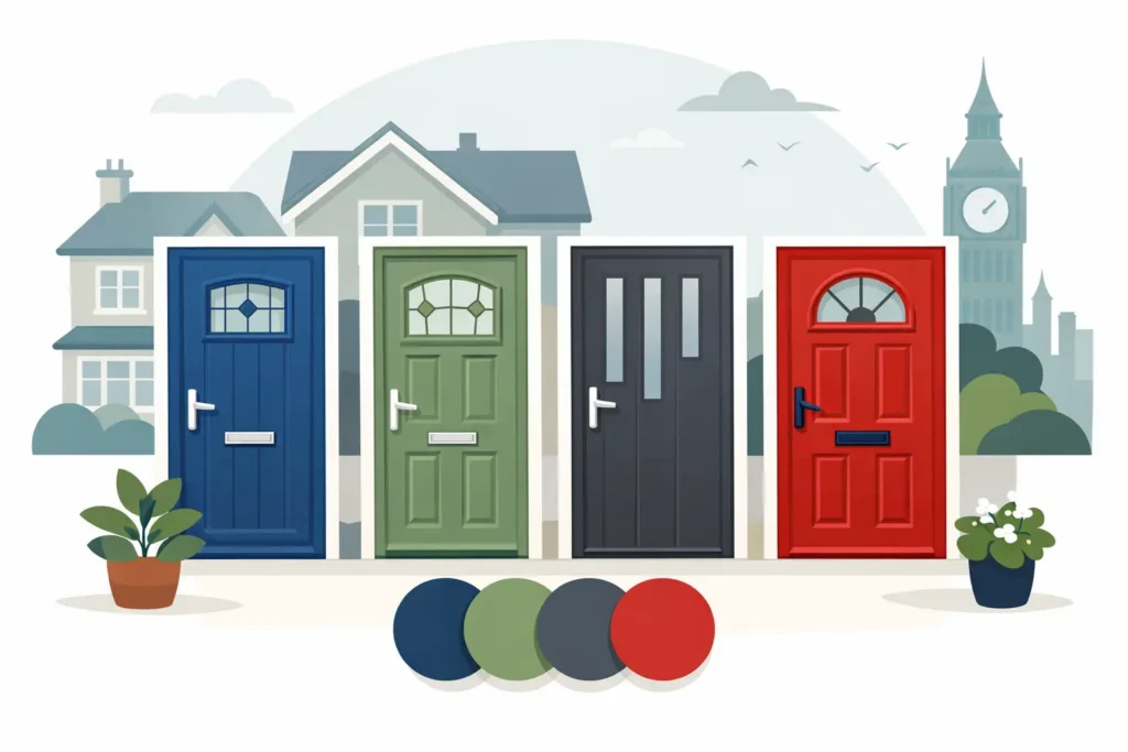
A composite front door is one of the first details people notice from the pavement. It frames the entrance, sets the tone for the property and can make an older exterior feel far more considered. The best colours for composite doors are not simply the shades currently in fashion. They are the colours that work with your brickwork, windows, roofline and the character of the home – while still looking smart after everyday exposure to the British weather.
For homeowners updating an existing door, a professional spray finish can create the fresh, factory-quality appearance of a new colour without the disruption of a full replacement. The right choice should feel intentional, not temporary, so it pays to look beyond a small sample card and consider the whole elevation.
Start with the character of your property
There is no single best door colour for every home. A bold shade can give a plain frontage real personality, but may look out of place on a traditional stone cottage. Equally, a subtle neutral can bring balance to a busy façade but may disappear against similar brickwork.
Look at the fixed elements first: the tone of the bricks or render, window frames, garage door, roof tiles, paving and any metalwork. These are costly or inconvenient to change, so the front door colour should bring them together rather than compete with them.
Period properties often suit deeper, heritage-inspired shades, particularly where there are original features such as stained glass, stone surrounds or traditional porches. Newer homes can carry crisp modern neutrals, rich dark tones and more confident contemporary colours. The aim is not to follow a rulebook, but to choose a colour that makes the entrance feel part of the building.
The best colours for composite doors
Anthracite grey for a modern, tailored finish
Anthracite grey remains a popular choice for good reason. It is smart, versatile and works particularly well with white, black or grey window frames. On modern render, pale brick and properties with clean architectural lines, it creates a polished contrast without feeling overly severe.
The trade-off is that very dark greys can absorb more heat in direct sunlight and may show dust, rain marks or pollen more readily than mid-tones. A high-quality exterior coating and thorough preparation are essential for a finish that performs well over time. If anthracite feels too strong, a softer graphite or mid-grey can deliver much the same contemporary effect.
Black for strong kerb appeal
A black composite door has a timeless quality. It can look striking on a Victorian terrace, elegant on a Georgian-style property and sharp against white render. Black also works well when the property already has black railings, lanterns, gutters or window details.
It is worth paying attention to undertones. Some blacks are cool and almost blue-black, while others have a softer charcoal warmth. The wrong black can appear harsh alongside warm red brick, whereas a carefully chosen shade can look beautifully balanced. Black is best where there is enough contrast around the doorway to define the entrance.
Deep blue for classic character
Deep navy and inky blue are excellent alternatives to black. They have the same sense of depth and formality, but can feel less stark in daylight. Blue works especially well with white timber-style features, limestone details, pale render and traditional red brick.
A blue door can also offer a more distinctive look without becoming overly colourful. Avoid choosing from an online image alone, however. Light can alter a shade considerably, with a navy that looks refined indoors appearing much brighter in direct sun. Viewing colour samples against the property is always the more reliable approach.
Green for heritage and natural surroundings
Greens have become increasingly popular for homeowners who want warmth and individuality. Deep bottle green, forest green and muted sage can all look at home on cottages, rural properties and homes with natural stone or mature planting.
Dark green is particularly effective with cream render, warm brick and brass or aged-metal door furniture. Sage offers a lighter, softer feel and can suit contemporary homes as well as traditional ones. The key is to avoid a green that clashes with the existing exterior tones. Cooler greens generally sit better with grey stone and black detailing, while warmer olive-based greens complement buff brick and sandstone.
Classic white and soft off-whites
White is often overlooked because it is familiar, but it can be exceptionally effective. A crisp white composite door brings brightness to a shaded porch and suits homes with white windows, traditional mouldings or coastal character. It also provides a clean background for more decorative glazing and statement hardware.
Pure brilliant white can feel stark against some brickwork, so softer whites, cream and light stone shades may be more sympathetic. Lighter colours do tend to reveal mud splashes and marks around the handle area sooner, especially on busy family entrances. That does not make them impractical, but it does mean regular gentle cleaning matters.
Warm neutrals for understated quality
Taupe, mushroom, pebble and soft greige are ideal where a property needs a refined update rather than a dramatic contrast. These shades work well with contemporary brick, natural stone, timber cladding and muted exterior palettes. They can make a front entrance feel expensive and calm, particularly when matched with well-chosen handles, letterplates and lighting.
Neutral does not mean dull. A door with a subtle warm undertone can give more depth than standard grey, and it is often more forgiving of dust and day-to-day marks than very dark or very pale finishes. This is a sensible route for landlords, developers and homeowners seeking broad appeal without losing a premium feel.
Rich statement colours used with care
Burgundy, deep red, teal and certain muted plum shades can make a memorable entrance. These colours are most successful when they reflect something already present in the property, whether that is a brick tone, tiled path, stained glass detail or the home’s period style.
A statement colour is less about being loud and more about proportion. On a simple frontage with neutral walls, it can become an attractive focal point. On a façade with patterned brickwork, coloured glazing and ornate details, it may create too much visual noise. If you are uncertain, a deep, softened version of the colour usually ages better than a bright primary shade.
Match the door to windows and exterior details
Matching the front door exactly to window frames can create a neat, cohesive appearance, particularly on newer homes. This works well with anthracite, black and white schemes. However, an exact match is not essential. A contrasting door can add depth and help the entrance stand out.
Consider the finish as well as the colour. A carefully sprayed composite door can be colour matched to complement existing uPVC, aluminium or surrounding features where appropriate. This is particularly useful when the current door is sound but its colour is dated, faded or no longer fits with recent exterior improvements.
Hardware should be part of the decision, not an afterthought. Polished chrome feels crisp and modern, black hardware creates a coordinated contemporary look, while antique brass or aged finishes often suit dark green, navy and heritage shades. Small details can change the character of the same door colour considerably.
Think about light, orientation and maintenance
The colour seen on a showroom chip is rarely the colour you will see at your front door throughout the day. North-facing entrances receive cooler, lower light, which can make dark shades appear almost black. South-facing doors receive stronger sunlight and can make warm colours appear brighter than expected.
Ask to view a larger sample outside where possible, ideally against the wall or frame it will sit beside. Check it in morning, afternoon and overcast light. This simple step prevents many disappointing choices.
Maintenance is another practical consideration. Dark doors can show water spotting and dust; white and pale shades reveal scuffs and road grime; mid-tone greys, greens and neutrals are generally more forgiving. A professionally applied, durable coating is designed for exterior use, but gentle cleaning and avoiding abrasive products will help preserve the appearance of the finish.
When spraying is the right route for a colour change
If the composite door is structurally sound, respraying can be a practical way to achieve a completely different look. It avoids the unnecessary waste of removing a usable door and allows far greater freedom than being limited to a standard replacement colour range.
At Spray Granite Specialists, every door transformation begins with careful assessment and meticulous preparation. The surface must be properly cleaned, prepared and coated with suitable premium products to achieve an even, durable finish. This level of workmanship is what gives a refreshed door the refined appearance homeowners expect from a high-quality exterior upgrade.
The strongest choice is usually the one that suits your home rather than the one that is most visible on social media. Take cues from the building, view samples in natural light and choose a shade you will still be pleased to come home to in years to come.