
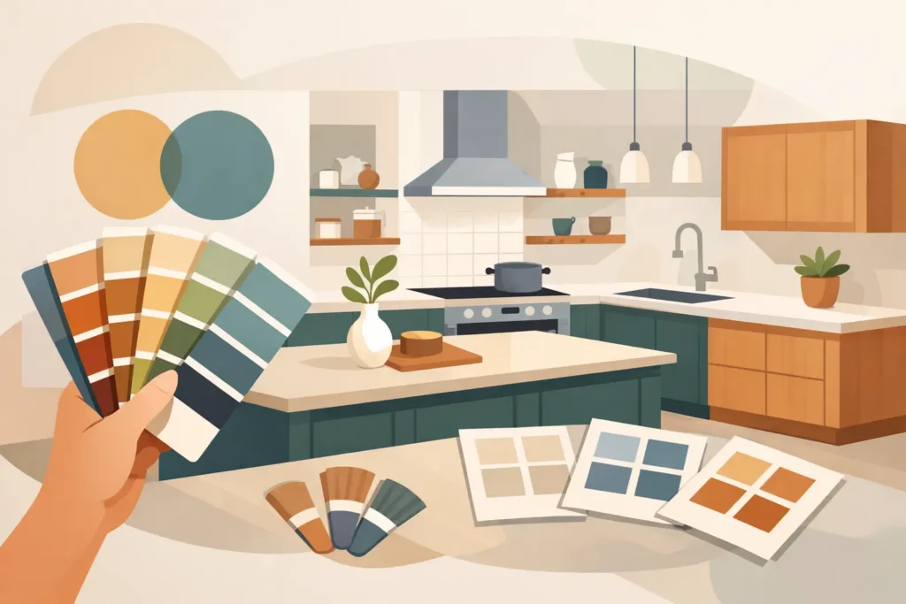
A kitchen can have sound cabinets, a practical layout and perfectly serviceable worktops, yet still feel tied to another decade because the colours are wrong. That is why choosing bespoke kitchen colours is about far more than selecting a shade card favourite. The right combination brings the room together, works with the light you actually have and gives existing surfaces a considered, high-end new look.
A professionally sprayed finish makes that decision especially rewarding. Rather than being limited to the colours supplied with replacement units, homeowners can refine the balance between cabinetry, worktops, splashbacks, walls and flooring. The result should feel intentional, not as though one element has been chosen in isolation.
Start with the parts of the kitchen you are keeping
Before choosing a cabinet colour, look carefully at the fixed finishes that will remain. A worktop, floor tile, stone-effect splashback or exposed brick wall may carry more visual weight than the cupboards themselves. These surfaces usually set the undertone for the whole scheme.
For example, a worktop with warm beige, cream or gold flecks generally sits more comfortably with warm whites, soft greiges, mushroom tones, olive greens or deeper earthy shades. A cool grey or blue-veined surface may suit crisp whites, charcoal, slate blue or cooler grey cabinetry. It does not mean everything must match precisely. In fact, a little contrast often creates a more premium result. What matters is that the undertones do not fight each other.
This is where professional colour matching and experienced advice are valuable. A colour can appear neutral on a small sample but reveal a green, pink, blue or yellow cast once it covers a full bank of doors. Viewing samples against the worktop and in the kitchen itself gives a far more reliable impression than choosing from a photograph online.
Choosing bespoke kitchen colours for your light
Natural light changes colour more than most people expect. A pale grey that looks elegant in a bright south-facing kitchen can seem cold in a room with limited daylight. Conversely, a deep blue or forest green can look rich and inviting in a well-lit open-plan space, but may feel heavy in a compact kitchen with a small window.
Think about the kitchen at different times of day. Morning light, afternoon sun and artificial evening lighting all affect how cabinetry is perceived. North-facing rooms often benefit from colours with a gentle warmth, such as off-white, warm grey, taupe or muted green. In rooms with plenty of sunlight, cooler neutrals and bolder darker colours can work beautifully without making the space feel closed in.
Artificial lighting should be considered at the same time. Warm bulbs can bring out yellow or red undertones, while cooler lighting can make some creams appear dull and some greys blue. If new lighting is part of the wider refresh, decide on it before finalising the finish. It avoids a disappointing surprise once the work is complete.
Light colours are not the only answer for small kitchens
White and pale neutrals remain popular because they reflect light and give a clean, spacious appearance. They are a strong option for smaller kitchens, rental properties and homes where a timeless look is the aim. However, a small kitchen does not automatically need to be all white.
A darker tone on lower cabinets, paired with a lighter wall colour or worktop, can create depth and make the room feel more tailored. Deep green, navy, charcoal and black-brown shades can be particularly effective when balanced with good lighting and lighter surrounding surfaces. The key is proportion. If cabinets, walls, flooring and worktops are all dark, the scheme can lose definition.
Build contrast with purpose
The most successful kitchens usually have a clear hierarchy. One finish takes the lead, one supports it and smaller details provide contrast. This could mean softly coloured cabinets with a darker spray granite worktop, or dark cabinetry paired with a light stone-effect surface. Handles, taps, appliances and splashbacks then complete the picture.
For a calm, contemporary look, choose colours that sit close together in tone. Warm white cabinets with a pale greige worktop and brushed brass details can feel refined without being fussy. For more impact, introduce contrast through one major surface. Matte dark cabinetry against a light worktop, for instance, gives a kitchen definition and visual structure.
Two-tone kitchens are also worth considering, especially where there is an island, peninsula or tall bank of units. Using a deeper shade on the island can make it a feature without overwhelming the rest of the room. It is usually wiser to keep the upper cabinets lighter, particularly in kitchens where they cover a large area of wall.
Choose a finish that suits everyday use
Colour is only one part of the decision. The sheen level changes how the same colour performs and feels. A matte or low-sheen finish has a soft, modern appearance and can help darker shades feel sophisticated rather than stark. It may, however, show marks differently depending on the colour and the level of use.
Satin finishes are often a practical middle ground. They provide a subtle light reflection, are easy on the eye and suit many traditional and contemporary kitchens. Higher-sheen finishes reflect more light and can suit a sleek, modern design, though they tend to draw attention to fingerprints, surrounding reflections and any imperfections in the surface beneath.
Meticulous preparation is central to a factory-quality sprayed result, whatever colour or sheen you select. Existing cabinets and worktops need to be assessed individually, then properly prepared so the finish is durable, smooth and appropriate for daily kitchen use. Colour samples tell part of the story, but the surface condition and required performance matter just as much.
Think beyond the current trend
A fashionable colour can still be the right choice, but it should make sense for your property and how long you intend to live with it. Sage greens, inky blues, warm neutrals and black accents have all earned their place because they are adaptable, not simply because they are popular. They work with natural materials, metallic details and a wide range of flooring choices.
Very specific shades can date quickly if they dominate every visible surface. If you are drawn to a bold colour, consider using it on an island, lower cabinets or a feature area, while keeping the main cabinetry more restrained. This approach gives the room personality but makes future updates to paint, accessories and hardware much simpler.
For landlords, developers and commercial settings, flexibility is often even more important. Neutral cabinet colours with carefully chosen worktops can appeal to a wider range of occupants or buyers, while still giving a tired kitchen a polished, modern appearance. A professional respray offers the opportunity to achieve that quality without the unnecessary disruption of removing sound units.
Test samples in the real room
Never judge a kitchen colour solely under showroom lighting or from a mobile phone screen. Place physical samples next to the worktop, splashback, floor and wall paint. Look at them vertically on a cabinet-height surface as well as flat, because light falls differently on each plane.
It is also helpful to stand back. A small sample may make a dark colour seem dramatic, but an entire run of cabinetry in that shade has a much greater visual effect. Consider what you see from adjoining rooms too, particularly in open-plan homes. The kitchen should relate naturally to the living and dining areas rather than feel like a separate colour experiment.
At a home consultation, an experienced spray finishing specialist can help identify these practical considerations before work begins. Spray Granite Specialists works with homeowners and property professionals to assess existing surfaces, discuss colour direction and create finishes that suit the space rather than a generic display kitchen.
Let the kitchen reflect how you live
The best kitchen colour is not always the palest, darkest or most on-trend option. It is the one that complements the surfaces you value, feels right in your home’s light and continues to look considered after the initial excitement of a transformation has passed. Take time with samples, trust the evidence in the room and choose a finish that gives your existing kitchen the luxury, durable new character it deserves.