
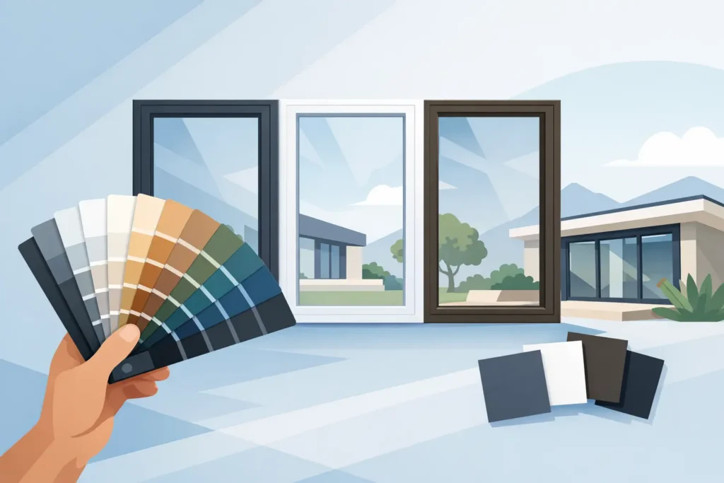
A window frame can quietly date an otherwise well-finished property. Faded white, a colour chosen for a previous owner’s taste, or frames that clash with new brickwork and doors can make a home or commercial frontage feel less considered. This aluminium window colour guide explains how to choose a shade that suits the building, supports the wider design and continues to look right once the initial excitement of a transformation has passed.
Aluminium is valued for its clean, slim profiles and contemporary appearance, but the frame colour does much of the visual work. It defines contrast, affects how large the glazing feels and can either link the exterior to the interior or make the two feel disconnected.
Start with the property, not the colour chart
The most successful aluminium window colour is rarely selected in isolation. Look first at the fixed elements that will remain around it: brick, render, stone, roof tiles, gutters, fascias, driveway materials and boundary walls. These surfaces usually occupy far more visual space than the frames, so they should set the direction.
For example, a warm red or buff brick often works well with softer blacks, deep bronze tones, charcoal greys and muted greens. Very blue-toned grey can look cold against a warm brick façade. By contrast, newer homes with pale render, clean rooflines and minimal detailing can carry cooler greys, black or crisp white with ease.
Period properties need an equally careful approach. A dark frame may give a striking update, but it should respect the proportions and character of the building. Deep heritage green, off-black, brown-black and restrained grey shades can offer a contemporary finish without making traditional elevations feel overly severe.
It also helps to assess colours outside. A sample that appears balanced in a showroom may look entirely different in direct sunlight, shade or against a large expanse of glazing. Viewing properly prepared colour samples against the property is a sensible part of the decision, particularly where a bespoke match is being considered.
The most popular aluminium window colours
Anthracite grey
Anthracite grey remains a popular choice for good reason. It is modern without being overly dramatic, works with many building materials and gives windows definition without the visual weight of pure black. It suits contemporary extensions, rendered properties and many brick homes, especially when paired with matching doors or guttering.
There is a trade-off, however. Not every anthracite shade is identical. Some are cooler and bluer, while others have a softer, warmer cast. On a north-facing elevation or a property with warm brickwork, choosing the wrong variation can make the exterior feel harsher than intended.
Black and off-black
Black aluminium frames create strong, architectural lines. They can make large glazing areas look refined, sharpen a modern façade and provide an effective contrast against pale render, timber cladding and lighter stone.
True black is bold. It can dominate smaller windows, show dust and water marks more readily, and may feel too stark beside traditional materials. Off-black, near-black and black-brown alternatives often provide a more forgiving result while retaining the same sense of depth. These shades are especially useful when homeowners want a premium look that does not feel severe.
White and softer neutrals
White frames are far from an outdated default when the right shade and finish are selected. They can keep an elevation light, preserve a traditional appearance and allow the glazing itself to take centre stage. Warm whites generally sit more comfortably beside cream render, sandstone and yellow-toned brick, while brilliant white can suit cleaner, more contemporary schemes.
Softer neutrals, including stone, mushroom, taupe and light grey, are increasingly chosen for properties where black or dark grey would feel too dominant. These colours give a quieter, tailored look and can work particularly well with natural stone, pale brick and country-style homes.
Heritage green, blue and bronze tones
For clients who want more character, muted colour is often the answer. Deep greens can sit beautifully within leafy settings and alongside traditional brickwork. Dark navy offers depth without the intensity of black, while bronze and brown-toned finishes can bring warmth to timber, stone and earthy render palettes.
These choices need confidence and context. A statement frame colour can elevate a carefully designed home, but it should be repeated elsewhere in small, considered ways – perhaps through a front door, metalwork or exterior lighting. One isolated colour can look accidental rather than intentional.
Match window frames with doors and exterior details
Windows and doors do not always need to match exactly. In fact, a little contrast can add interest. Dark aluminium windows with a timber-effect or richly coloured front door can create a more welcoming entrance than a fully matched scheme. Equally, matching window frames, bi-fold doors and a composite door can give a newer property a clean, coordinated appearance.
The key is to establish a hierarchy. If the front door is intended to be the focal point, keep window frames neutral and let the door carry the strongest colour. If large rear glazing is the feature, choose a window and door finish that makes those openings feel connected.
Do not overlook smaller details. Gutters, downpipes, soffits, garage doors, railings and external cladding all influence whether the finished result feels complete. Exact matching is not always necessary, but competing undertones are worth avoiding. A warm dark bronze frame and a noticeably cool blue-grey garage door, for instance, can jar even if both colours appear dark from a distance.
Consider the view from inside
Exterior colour tends to lead the conversation, yet the internal appearance of aluminium frames matters every day. Dark frames create a picture-frame effect around the view and can bring definition to open-plan spaces, particularly where black hardware, lighting or stair balustrades are already present.
Lighter frame colours are less visually intrusive. They can help smaller rooms feel open and are often preferable where the view is the main feature. A pale interior frame may also be a better fit for a softer, more traditional decorating scheme.
Where different interior and exterior requirements need to be balanced, discuss this at the planning stage. The aim is not simply to select a fashionable colour, but to create a finish that works from both sides of the glass.
Finish matters as much as the shade
A colour name alone does not tell the whole story. The sheen level changes how aluminium windows read in different light. Matt and low-sheen finishes tend to look contemporary and disguise minor surface marks well. Satin finishes provide a gentle, refined reflectivity, while higher-gloss options can suit certain traditional styles but show imperfections more readily.
Texture also has an effect. Fine-textured dark finishes can soften the appearance of black or charcoal frames and give them more depth. Smooth finishes may be better suited to minimal architecture or a cleaner, sharper design brief.
For existing aluminium frames, preparation is central to the quality and longevity of a refinished surface. Professional cleaning, careful masking, appropriate priming where required and controlled spray application help create an even, factory-quality appearance. The finish should look considered up close as well as from the kerb.
Should you follow trends?
Trends are useful for inspiration, not as a substitute for judgement. Anthracite grey and black have remained popular because they are versatile, but choosing them simply because they are common can lead to a result that does not suit the property. The same is true of bolder shades that look impressive on social media but may feel tiring on a whole elevation.
A more reliable approach is to choose a colour with staying power for your architecture, surroundings and planned improvements. Think ahead to changes you may make to render, landscaping, exterior lighting or doors. Aluminium window refinishing gives existing frames the opportunity to move with the property rather than forcing a costly replacement simply because the colour no longer works.
A considered colour change can transform existing frames
Changing the colour of aluminium windows can alter the entire feel of a property – making dated frames appear current, helping an extension connect with the original house or bringing consistency to a commercial frontage. It is a detailed process, and the quality of preparation and coating choice should be as carefully considered as the colour itself.
At Spray Granite Specialists, our experience in professional spray finishing helps clients make informed choices about shades, finishes and the wider design. The right aluminium window colour should feel natural to the building, enhance the space around it and give you a result you will be pleased to see every time you arrive home.